Over 60 percent of american tech teams rely on visual tools to track their project progress, yet many still struggle to spot delays before they become critical. Managing deadlines gets complex as workloads shift and goals change. Understanding how a burndown chart works can turn confusing data into clear guidance, helping every american project team stay focused and react quickly when things go off track.
Table of Contents
- Defining The Burndown Chart Concept
- Types Of Burndown Charts And Key Differences
- How A Burndown Chart Works In Projects
- Practical Uses And Workflow Integration
- Common Mistakes And How To Avoid Them
Defining the Burndown Chart Concept
A burndown chart is a strategic visualization tool that provides project managers and teams with a clear, real-time representation of project progress. According to Wikipedia, it is a graphical representation that tracks the amount of work remaining versus the time allocated for completion, predominantly used in agile methodologies like Scrum.
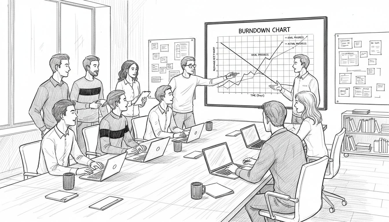
At its core, a burndown chart maps two critical axes: the vertical axis representing the amount of work left (typically measured in story points, tasks, or hours), and the horizontal axis representing time (usually in days or weeks). This simple yet powerful chart helps teams rapidly understand their project trajectory, identifying potential bottlenecks, predicting completion timelines, and maintaining transparency around work progress.
The mechanics of a burndown chart are straightforward but profoundly insightful. Teams start by establishing the total workload at the project’s beginning, creating an ideal, linear trajectory of work completion. As the project advances, actual progress is plotted against this ideal line. Dips below the line indicate the team is ahead of schedule, while points above suggest potential delays or unexpected complications. This real-time visual feedback enables teams to make swift, informed adjustments, ensuring projects stay on track and resources are optimally allocated.
Key characteristics of an effective burndown chart include:
- Clear, straightforward visual representation
- Ability to track work completion in real-time
- Immediate insight into project health and potential risks
- Transparent communication of team performance
- Supports data-driven decision making
By transforming complex project data into an easily digestible graphic, burndown charts empower teams to maintain momentum, predict challenges, and drive consistent progress toward successful project completion.
Types of Burndown Charts and Key Differences
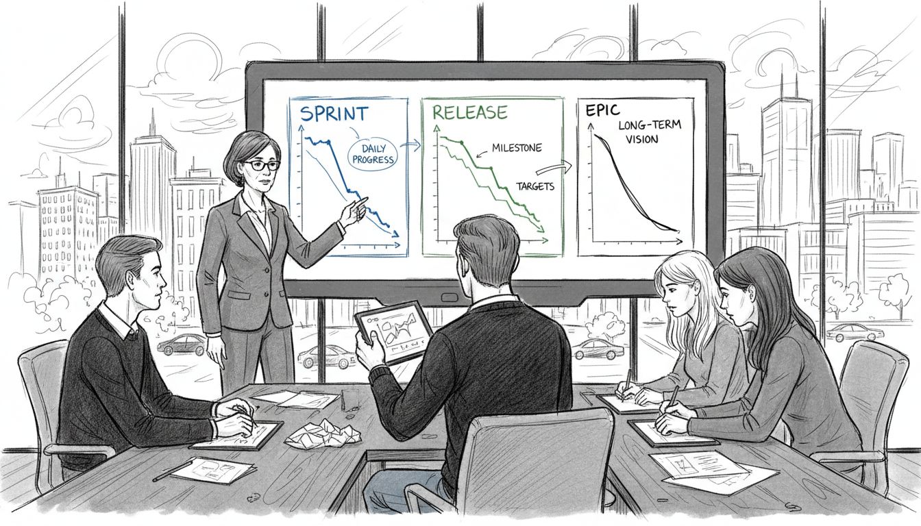
Burndown charts are not a one-size-fits-all project tracking tool. According to Capterra, these visual project management instruments come in multiple variations, each designed to address specific tracking needs within agile methodologies. The primary types include sprint burndown charts, release burndown charts, and epic burndown charts, each offering unique insights into project progression.
Sprint burndown charts focus on short-term project iterations, typically spanning two to four weeks. These charts track work completed within a single sprint, helping teams monitor daily progress and quickly identify potential roadblocks. Release burndown charts provide a broader perspective, mapping progress across multiple sprints toward a complete product release. These charts help project managers and stakeholders understand overall project trajectory and estimate potential completion timelines.
Interestingly, PM Study Circle highlights a critical distinction between burndown and burnup charts. While burndown charts emphasize remaining work, burnup charts spotlight work already completed. This nuanced difference can significantly impact how teams perceive and manage project progress. Each chart type offers a unique lens:
- Sprint Burndown: Tracks work within a single iteration
- Release Burndown: Monitors progress across multiple sprints
- Epic Burndown: Follows large, complex project initiatives
- Burnup Charts: Emphasizes completed work instead of remaining tasks
Understanding these variations allows project managers to select the most appropriate visualization technique, enabling more precise tracking, better communication, and more effective project management strategies. The right burndown chart can transform complex project data into clear, actionable insights that drive team performance and project success.
How a Burndown Chart Works in Projects
Wikipedia defines burndown charts as powerful tools that plot remaining work against time, enabling teams to visualize project progression and forecast completion dates. At its fundamental level, a burndown chart operates through a systematic tracking mechanism that translates complex project dynamics into a clear, comprehensible visual representation.
The operational process begins with establishing a total workload at the project’s inception. Teams calculate the entire scope of work, typically measured in story points, tasks, or estimated hours. This total becomes the starting point on the vertical axis of the burndown chart. The horizontal axis represents time segments - usually days or weeks of the project timeline. An ideal progress line is then drawn from the total workload down to zero, representing a perfectly linear path of work completion.
As the project advances, actual work completion is plotted against this ideal trajectory. Each day or week, teams update the chart by marking the actual amount of work remaining. Critically, this creates two primary lines: the ideal linear progression and the actual work completion line. When the actual line follows or dips below the ideal line, it signals the team is on track or ahead of schedule.
 Conversely, when the actual line rises above the ideal line, it indicates potential delays or unexpected complications that require immediate attention.
Key elements that make burndown charts effective include:
- Real-time visual representation of project progress
- Clear indication of work completion rate
- Immediate identification of potential scheduling risks
- Transparent communication of team performance
- Predictive capabilities for project timeline management
By transforming abstract project metrics into a straightforward graphic, burndown charts provide project managers and teams with a powerful tool for maintaining momentum, anticipating challenges, and ensuring consistent progress toward successful project completion.
Practical Uses and Workflow Integration
As project management tools continue to evolve, burndown charts have emerged as critical instruments for streamlining team workflows. According to Capterra, these charts help teams monitor sprint progress, dynamically adjust workloads, and ensure timely delivery of project milestones, making them invaluable in modern agile environments.
The practical application of burndown charts extends far beyond simple tracking. Resource allocation becomes significantly more strategic when teams can visualize work progression in real-time. PM Study Circle highlights that these charts aid in identifying scope changes during projects, allowing managers to make immediate, data-driven decisions. By providing a transparent view of work remaining, teams can proactively redistribute tasks, balance team member workloads, and prevent potential bottlenecks before they become critical issues.
Workflow integration typically involves several key strategic approaches:
- Daily stand-up meetings using burndown chart insights
- Sprint planning and retrospective sessions
- Continuous performance tracking and adjustment
- Stakeholder communication and progress reporting
- Early identification of potential project risks
Successful implementation requires more than just creating the chart. Teams must commit to regular updates, honest reporting, and using the chart as a collaborative tool for continuous improvement. When used effectively, burndown charts transform from simple tracking mechanisms into powerful strategic planning instruments that drive team productivity and project success.
Common Mistakes and How to Avoid Them
Burndown charts can quickly become ineffective when teams fail to apply them strategically. Capterra warns that common mistakes include inconsistent updating and misinterpreting data, which can derail project tracking and create false impressions of progress. Understanding these pitfalls is crucial for teams seeking to leverage burndown charts as powerful project management tools.
Scope creep represents one of the most significant challenges in maintaining accurate burndown charts. PM Study Circle emphasizes that failing to account for project scope changes can lead to wildly inaccurate progress assessments. Teams must develop a disciplined approach to documenting and integrating scope modifications, ensuring the burndown chart remains a true reflection of current project dynamics. This means regularly reassessing total workload, adjusting estimated hours, and transparently communicating changes to all stakeholders.
Key mistakes to watch for and strategies to overcome them include:
- Inconsistent Updates: Set daily or weekly mandatory chart update times
- Ignoring Scope Changes: Implement a formal change tracking process
- Overcomplicating the Chart: Keep visualizations simple and clear
- Treating Charts as Absolute Predictions: Use charts as flexible guidance tools
- Lack of Team Engagement: Involve entire team in chart maintenance and interpretation
Successful burndown chart implementation requires more than technical accuracy. It demands a cultural commitment to transparency, continuous improvement, and honest communication. Teams that view these charts as collaborative tools rather than punitive measurement instruments will ultimately derive the most value from this powerful project management approach.
Boost Your Team’s Efficiency with Smart Project Tracking
Understanding the power of a burndown chart means knowing how vital clear, real-time visualization is for managing workloads and hitting deadlines. If you have faced challenges like inconsistent progress updates, scope creep, or losing track of project health, integrating these insights with the right tools can transform your workflow. A platform that combines automation, task management, and collaboration in one place is what your team needs to stay on course and reduce administrative overhead.

Discover how Gammatica.com helps teams streamline their project tracking through AI-driven task management and dynamic checklists that update in real time. With features like calendar coordination, permission controls, and CRM integration, your team can maintain transparency and quickly adapt to changes just like a burndown chart illustrates. Act now to reclaim hours every week by automating routine management tasks and gaining actionable insights. Start optimizing your projects today at Gammatica.com.
Frequently Asked Questions
What is a burndown chart?
A burndown chart is a visual tool used in project management to track the amount of work remaining against the time allocated for project completion. It provides a graphical representation that helps teams understand progress, identify potential bottlenecks, and predict completion timelines.
How do you interpret a burndown chart?
To interpret a burndown chart, you compare the actual progress line with the ideal progress line. If the actual line is below the ideal line, the team is ahead of schedule. If it is above, there may be delays or complications that need addressing.
What are the types of burndown charts?
The main types of burndown charts include sprint burndown charts, which track progress within a single sprint; release burndown charts, which monitor multiple sprints towards a product release; and epic burndown charts, which follow larger project initiatives. Each type offers different insights depending on the project’s scope.
What are common mistakes to avoid when using burndown charts?
Common mistakes include inconsistent updating, ignoring scope changes, overcomplicating the chart, treating it as an absolute prediction, and lack of team engagement. To avoid these, maintain regular updates, implement formal change tracking, simplify visualizations, use the chart as a flexible guideline, and involve the entire team in its maintenance.